
Hands-On: The New IWC Mark XX: Yes, It’s Better. But Is It The Mark Series We Want?
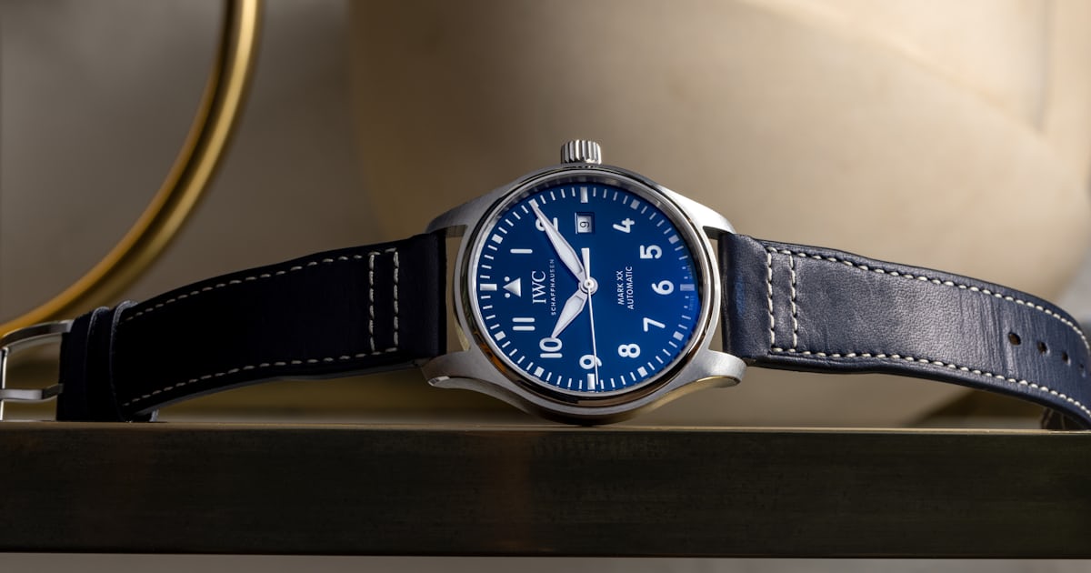
The most noticeable change to the dial is that every dial iteration of the Mark XX now has a contrasting white date wheel. Usually, I’d be partial to the blend-it-in approach of the black-dial Mark XVIII, where the date wheel is the same color as the dial (if you have to have a window, make it discreet). But here, I think the white date wheel balances out all of the other white print on the dial. This is where the other changes on the dial come in. Everything else has been moved closer to the center of the dial; the numerals align better with that pesky date window, making the window fit in a bit more seamlessly with the rest of the design (honestly, I still think the date window is a touch too close to the center). The minute markers beside the three, six, and nine have all been lengthened (they were squares like the rest of the thick markers on the Mark XVIII). Even the 12 o’clock marker and IWC logo have been adjusted, leaving less awkward negative space. Together, these small tweaks make the dial feel more balanced; look at the Mark XVIII next to the Mark XX and some of the XVIII’s negative space just looks awkward by comparison. Oh, and the hands stand out more now too: they’re rhodium-plated instead of matte black. Again, all of these are relatively minor changes, but together, they’re enough to add up to a new edition of the Mark Series.