
Hands-On: Tudor’s Black Bay Pro Gets A Surprisingly Dramatic Facelift With An Opaline Dial
This year, Tudor has added a new dial to the Black Bay Pro lineup. Since the model’s one and only variant was introduced back in 2022, folks have been speculating when the next update would be, especially as the Black Bay 58 GMT was introduced last summer as a significantly thinner option in the family. Would that mean that the MT5652, as a 7.5mm tall GMT caliber, would now be obsolete in light of this new thinner MT5450-U movement?
Alas, the MT5652 is here to stay. We all should have expected as much when, in December, Tudor released the Pelagos FXD GMT with the same movement. So with this new Black Bay Pro, all we get is a new dial — no updated case or caliber. But a new dial can go a long way in invigorating a model while still keeping to the same formula. On paper, this is a very insignificant update. Black dial model gets a new white dial version? A tale as old as time. But I do think that this new Black Bay Pro warrants a closer look because it’s making me think about this watch in a new light.


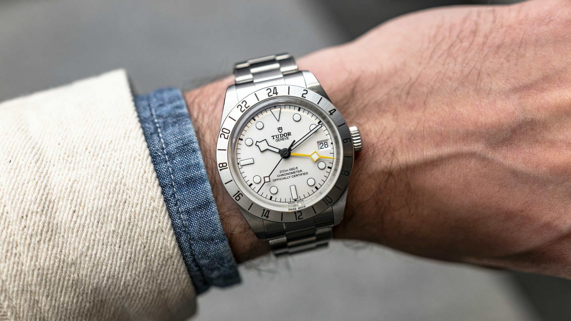
Most specs on this update remain the same. The case is still a reasonable 39mm in diameter with 20mm lugs, while keeping that oft-complained-about thickness of 14.6mm. Granted, while the height is in part due to a very tall and pronounced crystal (even more exaggerated because of the thinner fixed bezel on the Black Bay Pro), the cases of the Black Bay line often draw more criticism due to their slab sides. A simpler, blockier case means less in the way of visual trickery when it comes to making a case optically thinner, as we’ve seen many other brands do successfully. On the wrist, it is ironically the smaller diameter of the watch that makes it seem taller than it really is. Even with the hefty faux-rivet bracelet with adjustable T-fit clasp, the Black Bay Pro presents as a more top-heavy wearing experience (more on that in a little bit).
Surrounding the tall sapphire crystal is that fixed bezel, which I find very attractively beveled with a contrasting polished finish on the side to give a little bit of glimmer to an otherwise very industrial design. And of course, this all leads to this new opaline (or as everyone would say in the halls of the Palexpo, white) dial. As far as Tudor dials go, this might be one of my favorites. It is refreshing, clean, and legible. Something I absolutely loved about my original black dial variant was the rough texturing of the hands, thankfully staying the same in this version. The black dial Black Bay Pro’s “phantom” hands are gone, with the exception of the bright yellow “Snowflake” GMT hand, given that the hour, minute, and second hands are now all completely coated in the black paint all the way to the center post. When paired with this opaline dial, these hands are the perfect juxtaposition both in terms of textures and legibility. This is the highest contrast you could pretty much ask for on a dial.

Another big visual change here comes in the hour markers. One of the most unique design details of the black dial is lost in this new update, which were the monoblock ceramic lume plots that almost seemed to float on the dial. In a rational decision to preserve legibility, these monobloc lume plots are now surrounded by a black border. It’s great for contrast, though less interesting, and resembles regular applied lume-filled indices. But interesting or not, the small details that go into this new opaline dial make it my favorite light-colored dial in the entire Tudor range.
I remember the launch of the original Tudor Black Bay Pro fondly. A flyer GMT, in a 39mm case and a fixed bezel? It seemed like the perfect Tudor for me at the time, even outweighing my dislike for beige indices (or “fauxtina”), and despite many decrying that the watch was a Rolex Explorer II ref. 1655 ripoff (I really didn’t find it as such, and neither did many colleagues). And so the day of launch, I reached out to my local Tudor retailer and got their first one, less than a week later. Then came the honeymoon period, where for a few months I could declare no fault unto the watch, and the Black Bay Pro was an absolutely perfect design. But whether or not a watch ended up being a keeper depended on just how different you felt once that honeymoon period was over. Any gripe or critique of the watch was outweighed by the feeling of having a shiny new object on my wrist, and it was only after the honeymoon period that those small things started to build up.

I suppose I’ve already spoiled the ending — yes, I did end up selling the Black Bay Pro after about a year of owning it. I still loved the watch, but a few things that didn’t work for me ended up making me decide that this watch wasn’t for me in the long run. First, I’ve never been a fan of fauxtina, and I don’t think I ever will (I tried to convince myself otherwise for this specific watch). Sure, some might argue that the coloring of the hands and indices on the original Black Bay Pro was never fauxtina, just a design choice, but it was just a bit too off-white for my liking. Purely personal. The second thing I noticed was that the Black Bay Pro wore a bit more top-heavy than any of my other Tudors. With watches like the larger 41mm Black Bay, the heaviness seemed distributed across the mass, but the 39mm diameter with the 14.6mm thickness meant that you had to have a perfect fit to prevent it from slightly shifting around on your wrist.
The biggest dealbreaker for me was something I didn’t expect, and that was the T-Fit clasp. Surely the introduction of the clever quick-adjust system on the bracelet would mean that I could achieve a perfect fit each and every time, but the T-Fit clasp seemed to be just shy of perfection. After scrounging around the forums desperately looking to see if others found this an issue, it seems like I wasn’t alone. The T-Fit clasp traveled less than the span of a full link, which meant that when I took out a link, I’d need the T-Fit almost all the way expanded to fit properly. This means that if my wrist expands even further, I wouldn’t actually have any more room to really extend the clasp. On the other hand, if I added one link back, the T-Fit pushed all the way in, it still meant that the bracelet was too loose. With the Black Bay Pro being more top-heavy, this was a scenario in which I needed a Goldilocks fit on a bracelet, yet I couldn’t find it. Strike three.

So why am I bringing all of this up? It’s because, despite all this, I kind of miss that watch. The Black Bay Pro still sits in the Tudor lineup as a more singular design, not in part due to the proportions and fixed bezel. With this new dial, it genuinely is making me wonder if I want to give the Black Bay Pro another shot. The new color dial design feels much more modern than its black-dialed sibling, in the same way that Omega’s white lacquered dial Moonwatch felt in comparison to the original. As such, I would have also loved to see this version lose the rivets of the bracelet to double down on that context. But at the same time, for those who continue to maintain that the Black Bay Pro is simply an homage to a 1655, this surely gives a more unique proposition as a polarizing (heh, see what I did there) take on that original. Do I dare try again?
For more, read the original introducing post or visit Tudor online.
Hodinkee